When you're teaching teams about environmental, health and safety (EHS) metrics, data visualization is essential because you're reaching people of different ages, educational levels and they might even speak different languages. As you are presenting safety statistics, you want to make sure all stakeholders are responsive, alert, and in tune with your materials to help the environment, prevent workplace injuries, and most importantly – to save lives.
Displaying EHS Metrics in Presentations
When you present your statistical data to your staff, it’s important to clearly convey your messages in order to ensure that your key points about the need for safety are understood. Your goal in reporting and presenting EHS metrics in a visualized manner is to help you maximize awareness, productivity and connectivity with your staff. Below are a few ways EHS software can visualize your reporting data.
Pie Charts: Comparing a few key data points can help your charts show a precise message. For example, if you're showing the most common injuries on the job, you can list the top injuries along with its percentages. Presenting your EHS findings with percentages allows your staff to quickly identify strong and weak safety performance. Make sure your pie chart is clearly labeled to give a simple visual representation of the data you are displaying.
Bar Charts: This is another chart type to display data in a way that is beneficial to your staff. If you're giving them OSHA incident data that breaks down the top causes of fatalities, a clear chart that lists the type of fatality on one axis and the percentage of incidents on the other allows your staff to see the point you’re making about safety measures.
Trend Charts: Displaying your environmental, health and safety performance trends over time is advantageous. Trend lines give your department insight regarding historical and current performance, and based on those points, the management team can make changes to the organization's EHS program.
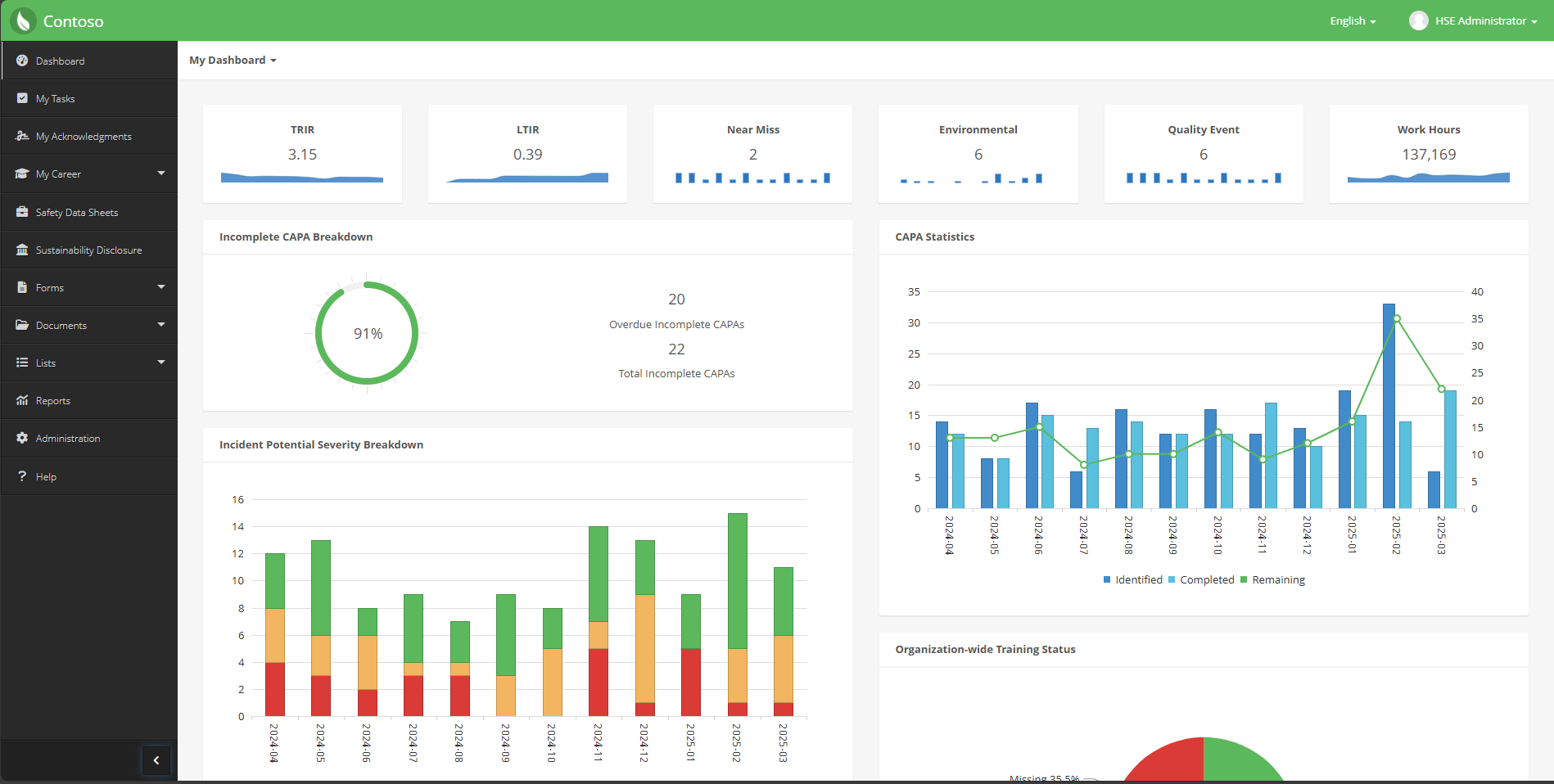
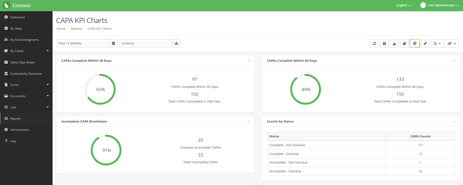
Dashboards: Combining all of your metrics into a dashboard is another great way to illustrate your department’s safety performance. With EHS software, you can easily setup an interactive dashboard for your colleagues to navigate and interact with different charts and EHS KPIs.
Ways to Ensure You Reach All Your Employees
Remember to keep in mind the different ways you plan to distribute your deliverables. Some staff members may want a hard copy of the reports while others may prefer to view them on a monitor, tablet or mobile device. Next, try to make your materials available in different languages to ensure your colleagues understand the information you're giving them. Lastly, reach out to any workers who weren't present during your presentations to review and sign off on the reports. At the end of the day, everyone is responsible for workplace safety.
Request a demo today to see how EHS Insight’s intuitive reporting can help you drive safety improvement.