One of the most important parts of managing a safety program is tracking and evaluating progress toward improved workplace health and safety. Key performance indicators, or KPI's, allow you to do that consistently and predictably.
By establishing a series of metrics and a process for data collection, reporting, and analysis, you’ll have an easier time preparing required reports as well as assessing and communicating your organization’s effectiveness at managing workplace health and safety.

Safety Lagging Indicators
When it comes to safety KPI metrics, lagging indicators such as TRIR, DART, Lost Workday Case Rates, and the number of recordables (compared to a previous time in history) have been widely used to try and show the overall health of a safety program.
However, there's a notable issue with this approach - these lagging indicators focus solely on failures, giving us a rearview-mirror perspective of injury occurrence and frequency. Unfortunately, they don't quite cut it when it comes to offering a complete understanding of the safety culture or the overall safety program. Despite this, they persist in being used as if they provide an all-encompassing picture. While having a high number of injuries is undoubtedly concerning, it's important to factor in additional elements to really grasp the full scope of the situation.
Essentially, relying solely on lagging indicators for safety metrics limits our ability to proactively tackle potential issues and holds us back from building a truly resilient safety strategy. To step up our safety management game, it's about time we start incorporating leading indicators and a more diverse range of metrics. This shift will give us a more forward-looking and comprehensive evaluation of safety performance, empowering us to stay ahead of the game.
Example
Let’s look at an example of a company with two locations.
- Location A with its 1000 employees has worked 2.5 million hours for the year and has experienced 20 recordable level injuries which gives them an incident rate of 1.6.
- Location B with its 250 employees has worked 512,500 hours for the year and has experienced 6 recordable level injuries which gives them an incident rate of 2.34.
During the meeting, upper management looks at the two incident rates and determines that Location A must have a better safety program and culture because their incident rate is lower than Location B’s.
But is that really true? No, because the rate is largely based on the number of hours worked and not on a safety-based activity or the severity of the injuries, etc.
Need more convincing? Ok, let’s say the 20 recordable injuries experienced by Location A have all been serious with at least two amputations and one fracture while the 6 recordable injuries experienced by Location B have all been much milder injuries like sprains and strains. Do you still think Location A has a better culture and safety program than Location B? Probably not.
Unfortunately, many in upper management don’t want to be bogged down with the details. They want to easily be able to look at a set of numbers and determine “good” or “bad”—which is one reason why lagging indicators like these are still so widely used.
Interestingly enough, the true indicator of a company's safety culture lies in the management's lack of interest in the details rather than the lagging indicators themselves. It may seem counterintuitive, but when management is not bogged down with the nitty-gritty, it gives a glimpse into the overall health of the safety culture.
If your organization is resistant to adopting leading indicators, there are still ways to effectively convey your message by incorporating additional information. This will provide a clearer illustration of the situation and help overcome any reluctance to change.
Here are two simple ways you can do that.
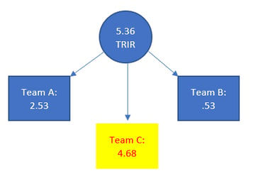 Instead of calculating one incident rate for the whole company or location, calculate multiple incident rates, one for each department or team. That way when one team is experiencing a high number of incidents. Here’s an example of what that might look like. As you can see, the overall TRIR is 5.36, but look at how it’s broken out. You can clearly see that one of the reasons is Team C.
- When presenting the number of injuries, don’t just provide a number. Provide a number with the type of injuries included. That way you’re letting people see the severity of the injuries. Here’s what that might look like:
| Location A |
Location B |
| 20 recordables |
6 recordables |
| 5 amputations |
3 strains/sprains |
| 6 lacerations requiring stitches |
2 eye irritation |
| 9 fractures |
1 bug bite |
Safety Leading Indicators
To paint a good picture of how healthy a safety culture or safety program really is, you have to include the key elements that go into making up that culture. These are the things that your workforce does every day to prevent injuries and illnesses from occurring. The reason why leading indicators give a clearer picture of the health of a safety culture is because when they aren’t getting done or aren’t being done well, there will normally be a rise in injuries. Why? Because these activities are being done to prevent injuries so naturally when injury prevention activities aren’t happening, the result is usually higher incident rates.
It may seem simple to look at your safety program and start tracking the things that you’re doing to prevent injuries, but how you do that is really important. To help with this, OSHA provides a terrific resource called "Using Leading Indicators to Improve Safety and Health Outcomes" which is full of information on leading indicators and how to use them to improve performance.
Let’s look at a few leading indicators and why they’re important to include.
Training Information
Tracking the number of courses/subjects being presented to the workforce and how many people completed the training is a great metric to track because everyone knows that good training sets the foundation for a safer workplace.
Near Misses
When you track near misses, you’re not only showing how observant your workers are but you’re also giving yourself a crystal ball into the future because todays near miss is tomorrow’s injury. The more near misses your workforce submits, the more issues you can correct before they can become injuries.
Employee Audits and Inspections
Tracking how many audits and inspections have been completed is one thing, but tracking the number of findings generated and resolved is another thing entirely. Doing this will provide a good picture of how robust your inspection and audit program are—but also how quickly issues get resolved.
Safety Meetings
Tracking safety meetings is a great leading indicator, if the right information is tracked. If you simply track the monthly safety committee meeting, you’re missing out on a bunch of other really good data! For example, if you include toolbox talks given on the shifts, one-on-one safety talks with individual employees, management or leadership safety meetings, etc., you’ll be providing a direct correlation between safety meetings and safety performance.
Safety Work Orders
Maintenance and safety go hand in hand so naturally being able to track the number of safety work orders submitted is important. But, instead of just presenting the number submitted, include information like how many were still open after 30 days of being submitted, the type of work order they were, etc. If your maintenance department is understaffed or if your workforce seems to think maintenance takes forever to get things done, having this data might help both of those situations.
JSA's and SOP's
Job Safety Analysis and Standard Operating Procedures (SOP) are important tools for a strong safety culture but just creating them isn’t enough, they actually have to be used and routinely reviewed to keep them in good shape. Tracking the number of JSAs and/or SOPs that were created and reviewed each month is a great leading indicator because it shows that not only is finding and resolving hazards a priority, but it’s become a formal process, too.
The most important thing to remember is that no matter what KPI's you use to measure performance, how you present them matters. You never want to paint a picture that’s not quite accurate, because doing that doesn’t help with growth and improvement.

If your organization is not quite ready to move away from using lagging indicators, that’s ok. It doesn’t mean you can't include a few leading indicators in your overall KPI's, nor does it mean you can’t provide some context to those lagging indicators to make them more meaningful which will paint a clearer picture.
If you have valuable data to track but are struggling to find a suitable solution, look no further than the EHS Insight's EHS software. Our software is designed to assist you in managing and analyzing your data effectively. Curious to see how it works? Sign up for a free trial and start the conversation today!